Over the last year we have been collaborating with the mobile phone operator Swisscom and the City of Geneva to materialize insights on urban centralities and the connectivity of central neighborhoods with peripheral towns. The fundamentals of this project rely on measures, maps and visualizations of the pulse of the city through the activity of its mobile phone networks.
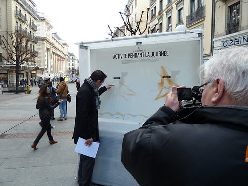
In the desire to make this work more public and raise the public awareness on the use of network data as part of urban management strategies, the Mayor of Geneva proposed to embed the data into were they are generated. To produce this ‘urban demo’ we collaborated with our friends at the Lift Conference to create an event and delivered aggregated network activity measures to the digital magicians at Interactive Things. Their evocative visualizations named Ville Vivante took the form of a visual animation and eight posters deployed at the Geneva central station from February 20th to March 4th 2012.
The visual animation
The posters present in key areas of the train station
And Interactive Things co-founder Benjamin Wiederkehr presenting the project and their magic at the Lift Conference
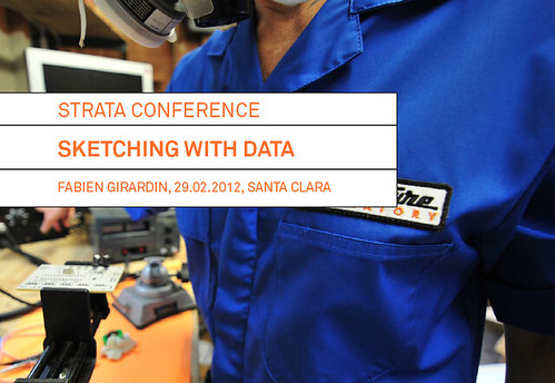
Last week I participated to the O’Reilly Strata Conference with a 40-minutes talk in the session on ‘visualization & interfaces’. My contribution suggested the necessity to quickly answer and produce questions at different stages of the innovation process with data. I extended the material presented at Smart City World Congress by adding some narrative on the practice of sketching by major world changers and focussing on Quadrigram as an example of tools that embraces this practice with data. The abstract went as follow:
Sketching with data
Since the early days of the data deluge, the Near Future Laboratory has been helping many actors of the ‘smart city’ in transforming the accumulation of network data (e.g. cellular network activity, aggregated credit card transactions, real-time traffic information, user-generated content) into products or services. Due to their innovative and transversal incline, our projects generally involve a wide variety of professionals from physicist and engineers to lawyers, decision makers and strategists.
Our innovation methods embark these different stakeholders with fast prototyped tools that promote the processing, recompilation, interpretation, and reinterpretation of insights. For instance, our experience shows that the multiple perspectives extracted from the use of exploratory data visualizations is crucial to quickly answer some basic questions and provoke many better ones. Moreover, the ability to quickly sketch an interactive system or dashboard is a way to develop a common language amongst varied and different stakeholders. It allows them to focus on tangible opportunities of product or service that are hidden within their data. In this form of rapid visual business intelligence, an analysis and its visualization are not the results, but rather the supporting elements of a co-creation process to extract value from data.
We will exemplify our methods with tools that help engage a wide spectrum of professionals to the innovation path in data science. These tools are based on a flexible data platform and visual programming environment that permit to go beyond the limited design possibilities industry standards. Additionally they reduce the prototyping time necessary to sketch interactive visualizations that allow the different stakeholder of an organization to take an active part in the design of services or products.
My name is Fabien Girardin. I used this blog between March 2003 and March 2014 to report on my readings, thoughts and milestones as part of my research, particularly in the domains of mobility, urban environments, and infrastructure-human interaction